Design is not your most important deliverable
The most important artifact from the design process is the conversation the designer should have with the rest of the team about the experience you want for your customers.
As designers, it’s our responsibility to curate the experience for people who have a motor, vision, hearing or cognitive disability. That experience should be thoughtfully defined.
Design guidelines
- Basic layout and structure
- Blindness
- Low vision
- Color perception
- Motor disabilities
- Photosensitivity
- Cognitive differences
Basic Layout and structure
The good news is that we’ve adopted a lot of accessible patterns by designing for mobile first.
Design mobile first
Using a website on a small screen simulates having vision and motor disabilities because the interface is smaller and can be difficult to see.
A properly built mobile experience is often more accessible by virtue of the limitations of small screens. We just need to carry those best practices to desktop sizes.
How mobile first design is more accessible by default
We have learned to accommodate using a small screen by:
- Simplifing customer flows
- This helps people with cognitive disabilities or language barriers
- Designing controls with large tappable areas
- This helps people with motor disabilties who might have difficulty performing precise actions on a screen
- Heightened color contrast for bright conditions (like being outside)
- This helps people with low vision who might have difficult seeing light gray text
Define headings logically
Don’t select headings solely by their size/appearance. Instead select headings based on the structure of the page.
Headlines are more than just bigger bolder text. They should contain meaning that forms an outline of the page.
Heading guidelines
- Start with a single
<h1>per page- This is the meaningful title of the page
- There should be only one
- Title major sections with
<h2> - Subsections of the
<h2>should be an<h3> - It should be rare that
<h4>and beyond is required.- Only very long or extremely complex pages will need
<h5>or<h6>
- Only very long or extremely complex pages will need
Headings create a skimmable outline
By reading through the headings, you can easily give a summary of the contents of the page.
<h1>My favorite taco recipe</h1><h2>Ingredients</h2><h2>Steps</h2><h3>Preparing the protein</h3><h3>Chopping the vegetables</h3><h3>Assembly and plating</h3>
<h2>Nutrition information</h2><h2>Related receipes</h2>
This is important for screenreader users because they can use shortcuts to gather all headlines together into an outline of the page and skip to each section.
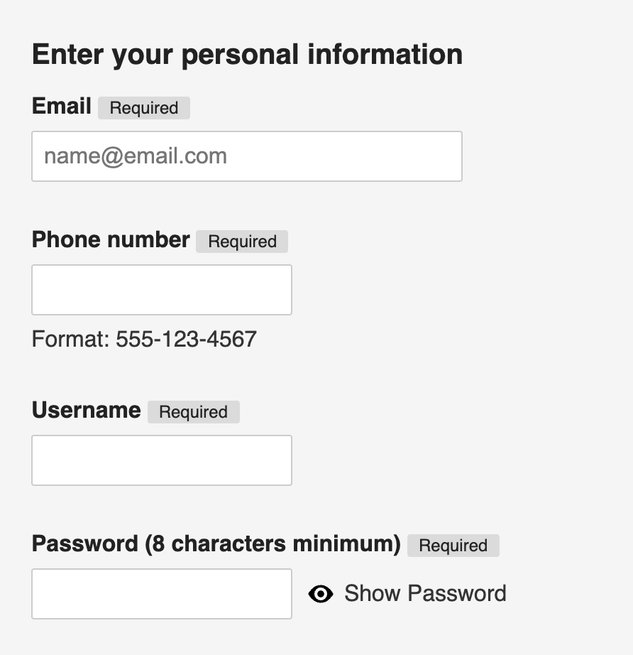
Keep elements vertically stacked and grouped by proximity
- Stack form labels and inputs vertically
- If a person has low vision and is using a zoom tool, they may not be able to perceive objects on the far right of the page.
- People will naturally and intuitively scroll up and down, but not left and right
- Don’t spread components wide across the page.
Consider simpler ways to convey content
Don’t use a complex interaction when a simple one will do.
- Carousels are almost always a bad idea.
- Interaction with any slide beyond the first visible content will invariably be quite low
- Read Should I use a carousel for more information
- Tooltips are always a bad idea
- Tooltips are idicative of poor UX copywriting practicies
- Information contained in tool tips is always better served re-written as a visible hint or as a modal
- Modals are often unnecessary and interruptive
- Don’t use a modal where an accordion expander a straightforward or link to another page will do
- Dropdown select menus should be used sparingly
- Only in cases where the content order is immediately recognizable by convention (alphabetical or numerical)
- Ex: Choose a state
- Ex: Choose a year
- If the content is mixed options (not alphabetical, numerical or logical) use radio inputs instead
- Only in cases where the content order is immediately recognizable by convention (alphabetical or numerical)
- Be wary of interactive mashups of controls
- Combining controls, buttons and interactions is often risky
- Ex: Text inputs between radio buttons
- Ex: A link inside a checkbox label
- Combining controls, buttons and interactions is often risky
Designing for blindness
People who are blind, dyslexic or low vision may use screen readers which are apps that read what’s happening on screen to them.
For people using a screen reader, code is the UX
Designers don’t have to learn to code, but they do need to understand that the code is the UX for people with disabilities and it’s the role of the designer to define the desired experience for all of your users. This cannot be left up to the developers.
You’ll need to define
- Heading structure in a logical way (not just by appearance)
altattributes for images when it’s appropriate- Meanginful
aria-labelsfor buttons and controls when the purpose isn’t clear- Ex: Repetitive instances links on the same page like “Learn more” or “Terms and conditions” may need an
aria-labeldescription in the code.- Ex:
aria-label="Learn more about treadmills" - Ex:
aria-label="Treadmill offer terms and conditions"
- Ex:
- Ex: Repetitive instances links on the same page like “Learn more” or “Terms and conditions” may need an
- Focus order (the order in which interaction occurs) when it’s not clear from the design
- Component types:
- Is an element a link or a button
- Should a toggle switch be a checkbox or a radio button?
People who are low vision may use zoom tools that enlarge the screen to extreme levels to consume content and increase contrast.
Following best practices for people with vision disabilities creates a better experience for all people.
Images and media
- Define alt text for images or icons where it adds editorial meaning to the page
- Good alt text would allow anyone who can’t see the screen to describe it to someone else
- If an icon doesn’t add meaning or would be repetitive, the alt attribute should be empty
Designing for low vision
It’s easy to only think about people using a screenreader, and not consider people with very low vision.
People with low vision may use enlarge the screen by pressing cntrl or cmd + on their keyboard to zoom in to the browser. They often also use zoom application tools that enlarge portions of the screen.
Design mobile first
If your screen reconfigures itself to the space available, using the browser’s zoom in/out controls can provide a great experience.
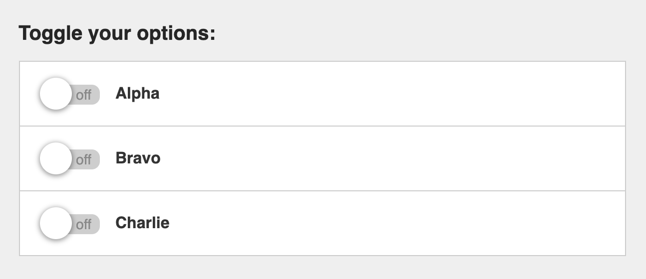
Associate controls visually
There are two interactive components that often fail for people with low vision:
Toggle switches
- It’s a common pattern to place toggle switches visuals on the far right side of the control.
- Instead, place the switch visual on the left side, the same way a checkbox or radio input would be placed.
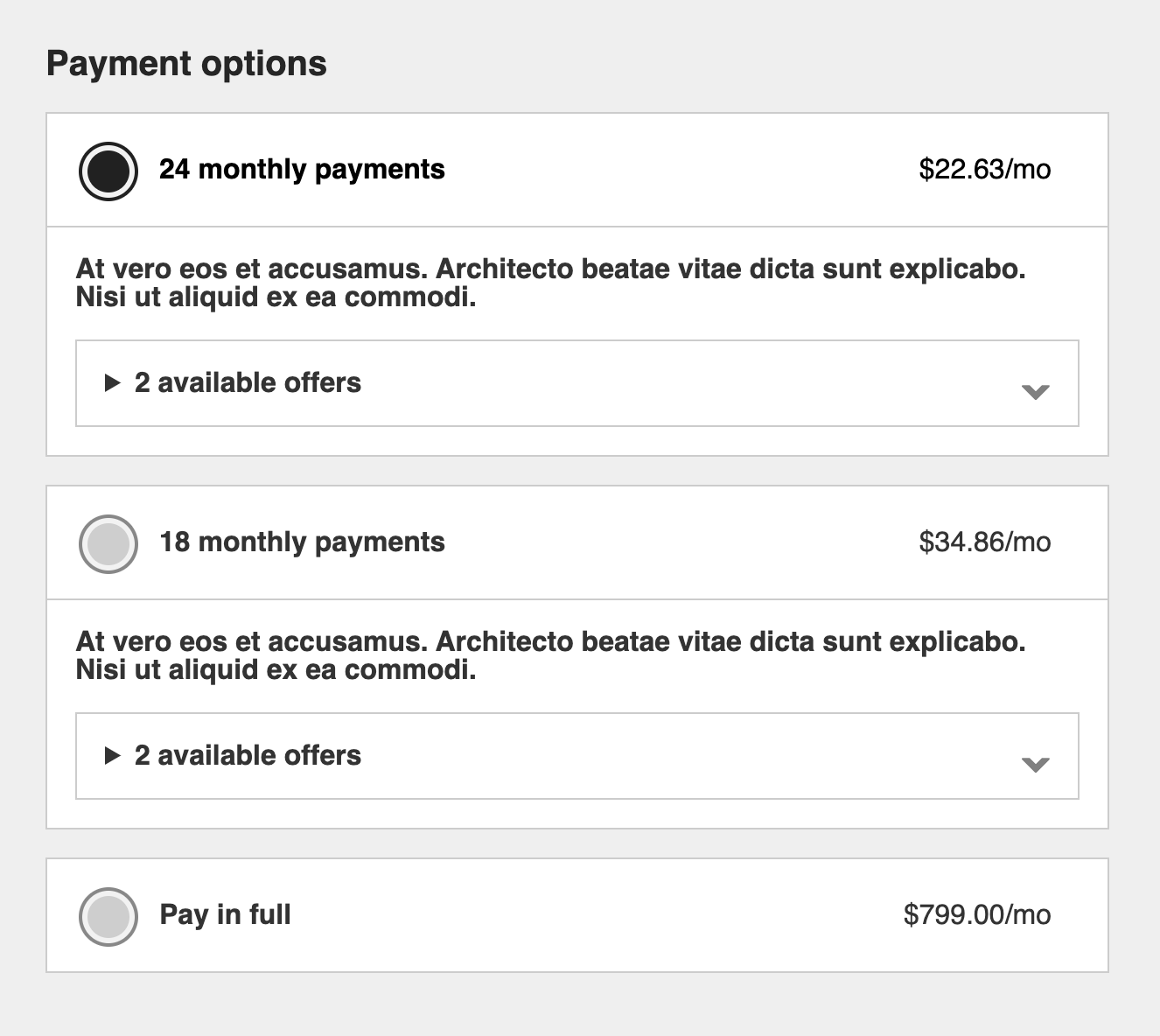
Accordion expander
- A common pattern for expander controls is a chevron or a +/- button on the far right side of the control to indicate its purpose.
- Instead, place the visual indicator on the left side, the same way a checkbox or radio input would be placed.
Stack form inputs
- It is a generally accepted best practice to stack labels and form inputs vertically rather than horizontally.
- When forms spread across the page it becomes difficult for people with low vision to find and complete all the inputs while using a zoom application.
Typography
- Paragraph font size should be no smaller than 16px (the default HTML size)
- Legal text no smaller than 14px
- Justify text left, do not fully justify text
- Ensure color contrast meets guidelines
- 3:1 for large text over 19px
- 4.5:1 for text under 19px
Designing for color perception
- Don’t use color as the sole means of conveying content
- Ex: Don’t use red/green for status messages without text labels
- Ex: Don’t display color swatches without text labels
Designing for motor disabilities
Keyboard and switch devices
- Not everyone uses a mouse or taps their screen to navigate their device
- Some people use a keyboard or switch device that may be as simple as a game controller
- Arrow keys browse content
- Tab key focuses interactive controls
- Spacebar or enter keys are used to activate controls
- They traverse the UI sequentially to “focus” on one interactive element at a time
Focus order
It’s important that elements come into “focus” in logical order and that focused items are clearly defined.
- Complex or compact features may need focus order identified for developers
- The order in which controls logically come into focus matters
- The default is top to bottom, left to right — just like reading
In this simple looking example, the developers will have a serious technical challenge to construct radio inputs with interactive elements inbetween that follow logical focus order.
If you don’t define precisely what you want, you will end up with a product that doesn’t make sense to people using their keyboard and screenreader.
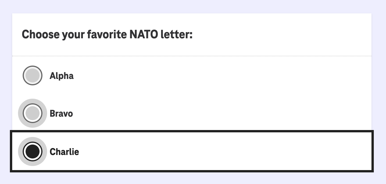
Focus states
Design for focus states
In the same way you design for hover states, you need to design for keyboard focus
This example shows radio inputs in default, hover and keyboard focused states.
Clickable area
- For people who have difficulty making precise movements, interactive elements need a minimum clickable target size
- Human interface guidelines puts this at 44x44px
Designing for photosensitivity
Some people with vestibular disorders or epilepsy can be made seriously ill by animations. These people may use reduced motion settings on their devices, but assume they aren’t using it.
- Plan how to honor reduced motion settings
- Moving features should be stopped but content should still be consumable
- Video or animatinos should have controls to be able to quickly pause
- Flashing content shouldn’t sequence more than 3x per second
- If you’re relying on flashing content to emphasize part of your design, please rethink your design decisions
Designing for cognitive differences
There is a wide range of considerations we can make to reduce cognitive load for people with learning disabilities or help support people who don’t speak English as their first language.
Use plain language
Be clear before being clever
- Not everyone understands content the same way
- Avoid using idioms or implying jokes
- Avoid technical jargon if a simpler explanation will do
Align names and labels with purpose
Buttons, links and other interactive features should be conventionally named according to their purpose
- Never use “click here” as a link
- Name core functionality according to conventions
- Ex: Don’t name your e-commerce “Cart” “Shopping sleigh” for the holidays
- Ex: Don’t label a link to purchase a product as “Check it out” — be clear about the purpose of the link.
Don’t write actionable sounding text that isn’t actionable
If content sounds or looks actionable, customer will try to click on it and become frustrated
- Ex: A large heading of “Shop new washing machines” will sound like a call to action for the screenreader rather than a headline
How I can help
I can attend a design review or provide training sessions.
Contact me to get started.